Main objectives of graphs in data analysis:
- Understand the properties of the data
- Detect patterns in the data
- Suggest modeling strategies
- Diagnose potential “bugs”
- Communicate results
Exploratory Data Analysis (EDA)
- Exploratory graphs cover the first four objectives above, so they are not primarily designed to communicate a final result.
- Typical features:
- They are produced quickly and in large numbers
- Their main goal is to understand the data
- Axes and legends are often simplified or removed
- Colors and sizes are used mainly to convey information
- Main simple graphs: a. Boxplot b. Histograms c. Barplot d. Scatterplot
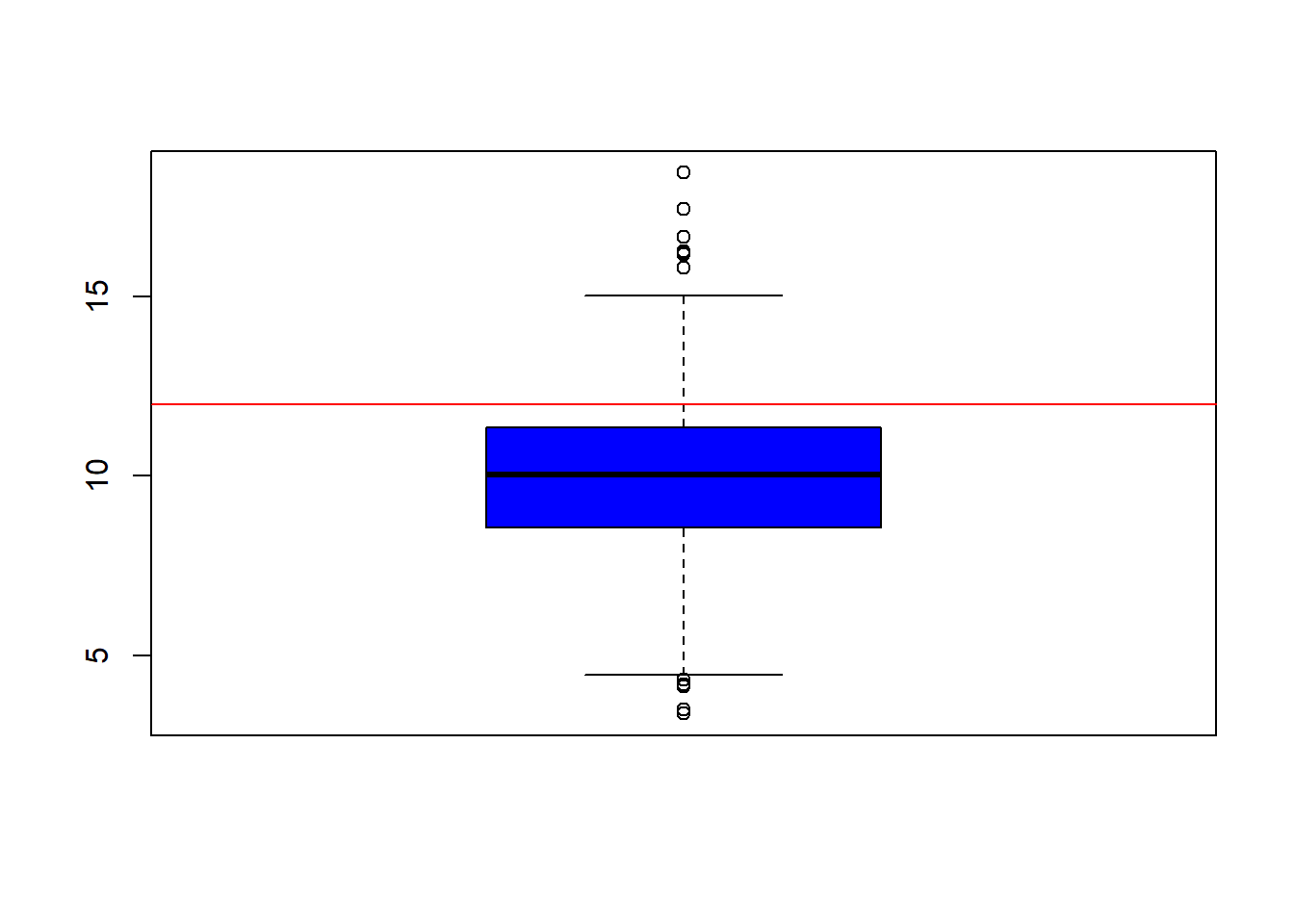
As an example, we use data from the U.S. Environmental Protection Agency (EPA), avgpm25.csv, which reports fine particulate pollution (PM2.5). The annual mean PM2.5 concentration should not exceed 12 \(\mu g/m^3\).
library(dplyr)
## Warning: package 'dplyr' was built under R version 4.2.2
##
## Attaching package: 'dplyr'
## The following objects are masked from 'package:stats':
##
##     filter, lag
## The following objects are masked from 'package:base':
##
##     intersect, setdiff, setequal, union
pollution = read.csv("https://fhnishida-rec5004.netlify.app/docs/avgpm25.csv")
summary(pollution)
##       pm25             fips          region            longitude
##  Min.   : 3.383   Min.   : 1003   Length:576         Min.   :-158.04
##  1st Qu.: 8.549   1st Qu.:16038   Class :character   1st Qu.: -97.38
##  Median :10.047   Median :28034   Mode  :character   Median : -87.37
##  Mean   : 9.836   Mean   :28431                      Mean   : -91.65
##  3rd Qu.:11.356   3rd Qu.:41045                      3rd Qu.: -80.72
##  Max.   :18.441   Max.   :56039                      Max.   : -68.26
##     latitude
##  Min.   :19.68
##  1st Qu.:35.30
##  Median :39.09
##  Mean   :38.56
##  3rd Qu.:41.75
##  Max.   :64.82
Diagrama de caixa (Boxplot)
Boxplot
- Displays the minimum, maximum, quartiles, and outliers.
boxplot(pollution$pm25, col="blue")
abline(h=12, col="red") # horizontal line at 12
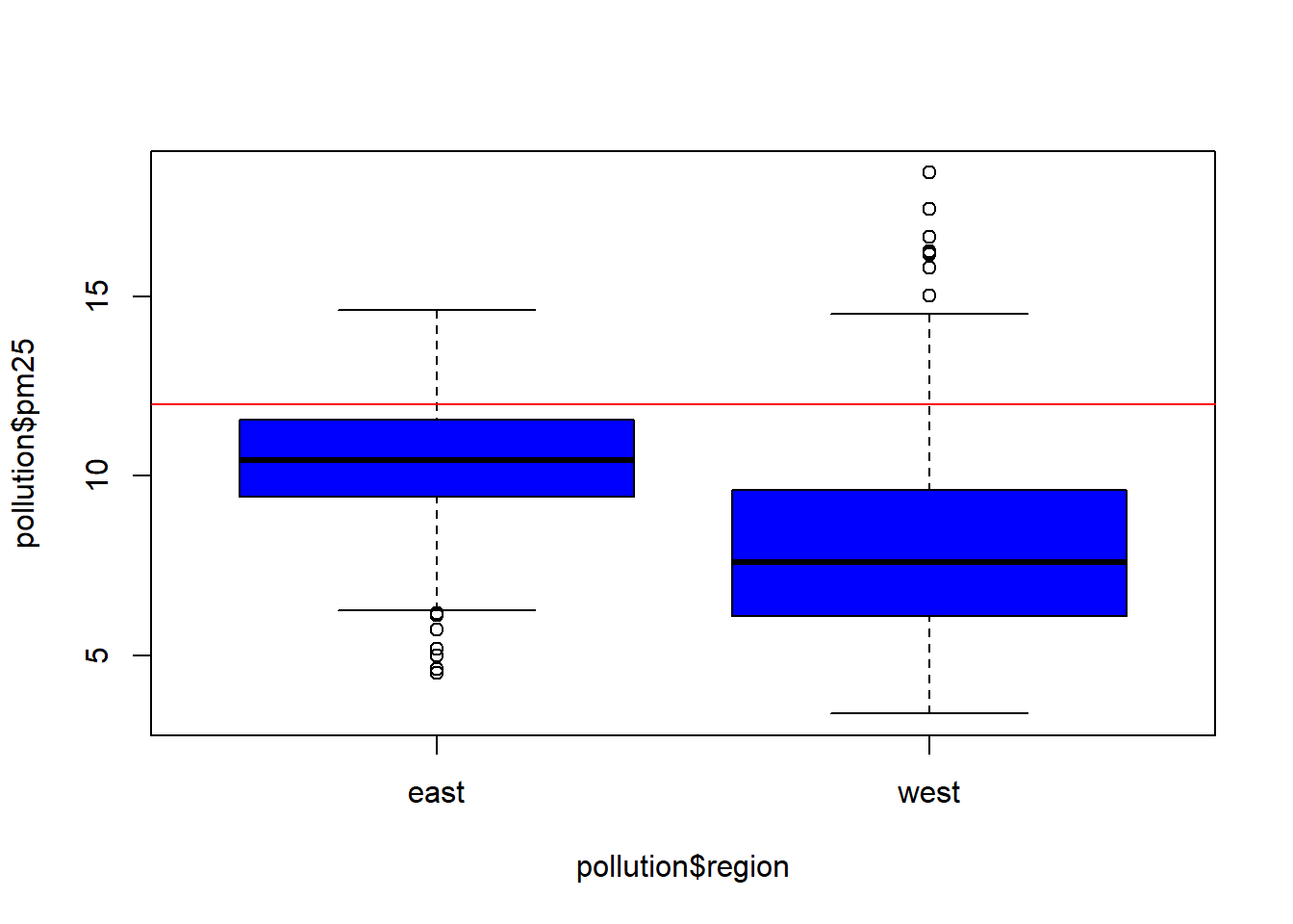
 - For multiple boxplots, we use `
boxplot(pollution$pm25 ~ pollution$region, col="blue")
abline(h=12, col="red") # horizontal line at 12
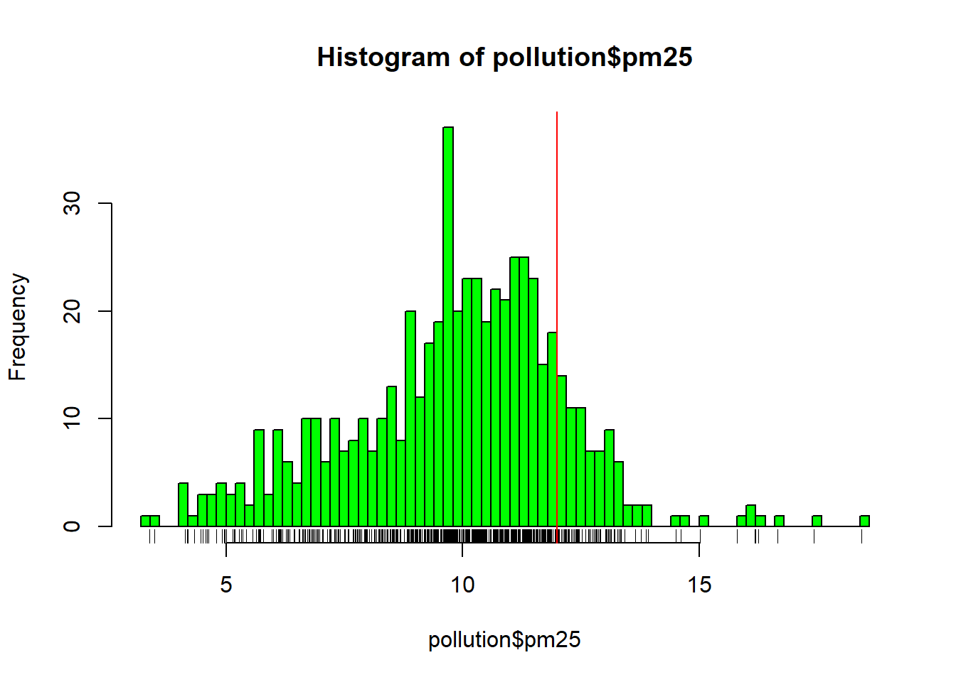
Histogram
hist(pollution$pm25, col="green")
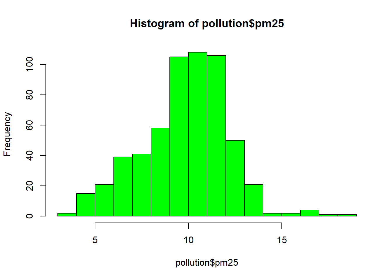
hist(pollution$pm25, col="green", breaks=100) # 100 bins
rug(pollution$pm25) # marks the sample values below the histogram
abline(v=12, col="red") # vertical line at 12
 - We can place more than one graph in the same figure using `par(mfrow, mar)`:
par(mfrow=c(2, 1), mar=c(4, 4, 2, 1)) # create a figure with 2 rows and 1 column plus margins
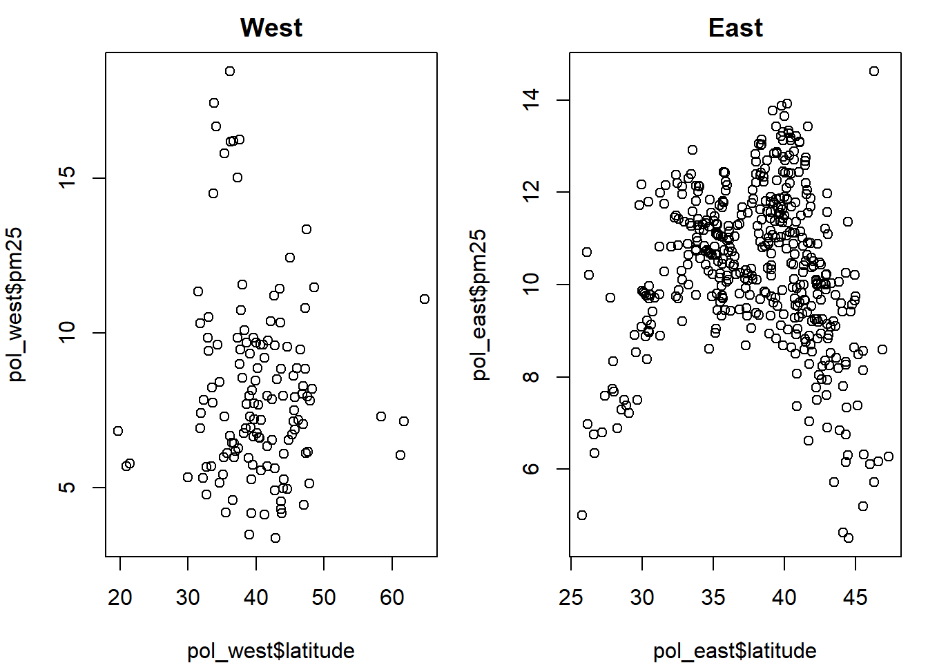
pol_west = pollution %>% filter(region == "west")
pol_east = pollution %>% filter(region == "east")
hist(pol_west$pm25, col="green")
hist(pol_east$pm25, col="green")
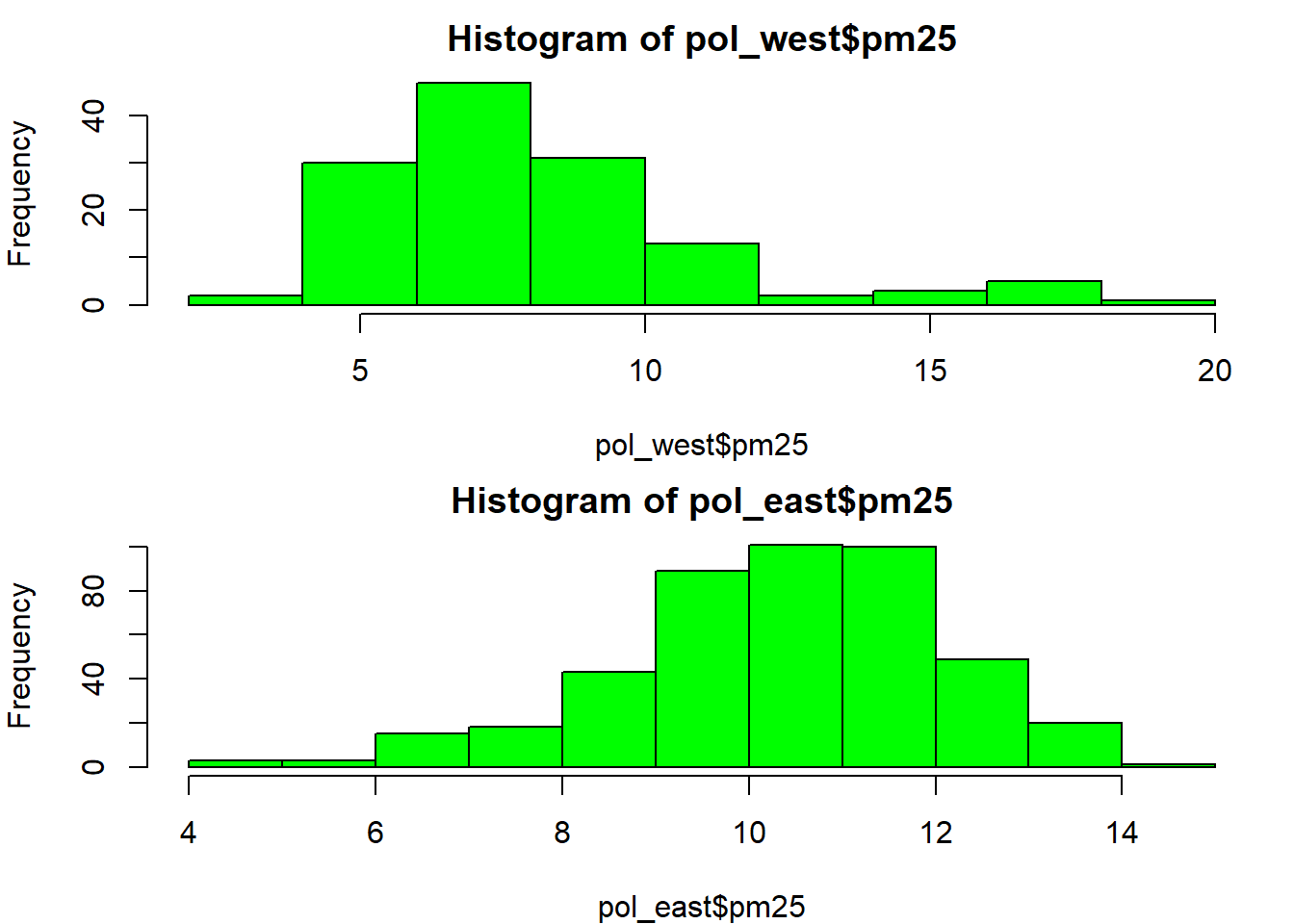
- Notice that you need
par(mfrow=c(1, 1))to return to a single graph per figure.
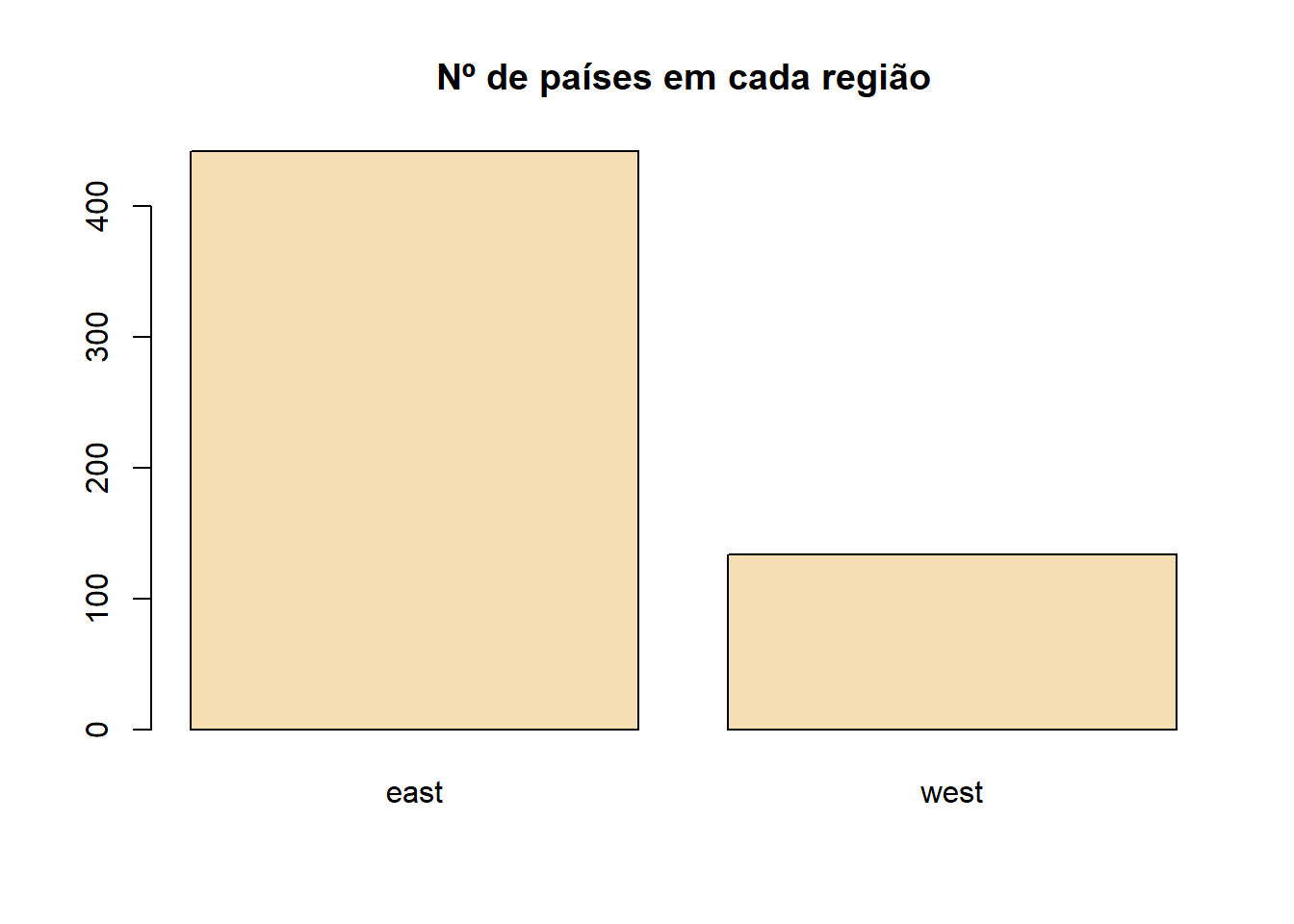
Barplot
barplot(table(pollution$region), col="wheat",
        main="Number of counties in each region")
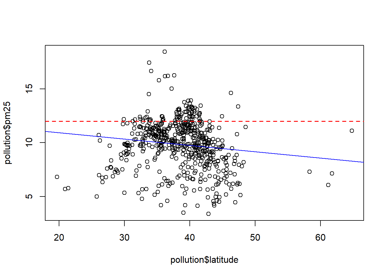
Scatterplot
- Produces two-dimensional graphs.
plot(pollution$latitude, pollution$pm25)
abline(h=12, lwd=1.5, lty=2, col="red")
abline(lm(pm25 ~ latitude, data=pollution), col="blue")
par(mfrow=c(1, 2), mar=c(4, 4, 2, 1)) # create a figure with 1 row and 2 columns plus margins

plot(pol_west$latitude, pol_west$pm25, main="West")
plot(pol_east$latitude, pol_east$pm25, main="East")
- We can also add graphical elements and text to a figure produced by
plot():abline(): adds horizontal, vertical, or regression linespoints(): adds pointslines(): adds linestext(): adds texttitle(): adds axis annotations, title, subtitle, and outer margin textmtext(): adds text to the inner or outer marginsaxis(): adds tick marks and axis labels
par(mfrow=c(1, 1)) # return to the default
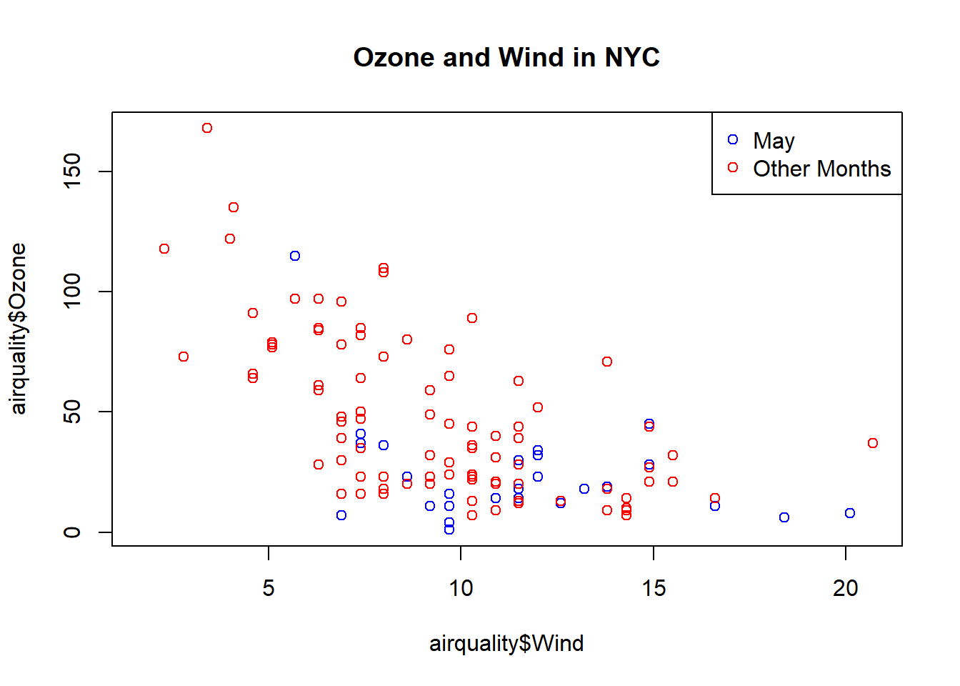
air_may = airquality %>% filter(Month==5)
air_other = airquality %>% filter(Month!=5)
plot(airquality$Wind, airquality$Ozone, main="Ozone and Wind in NYC")
points(air_may$Wind, air_may$Ozone, col="blue")
points(air_other$Wind, air_other$Ozone, col="red")
legend("topright", pch=1, col=c("blue", "red"), legend=c("May", "Other Months"))
Some important graphical parameters:
pch: plotting symbol for points (the default is a circle)lty: line type (the default is a solid line, but it can also be dotted, etc.)lwd: line width (integer)col: color, specified as a number, a text name, or a hexadecimal code (colors()returns a vector of named colors)xlab: label for the x-axisylab: label for the y-axispar(): function used to specify global parameters that affect all figures:las: label orientationbg: background colormar: margin sizeoma: outer margin size (default is 0)mfrow: number of graphs per rowmfcol: number of graphs per column
Grammar of Graphics (ggplot2)
Basic components of
ggplot2:- a data frame
- aesthetics: how the data are mapped into visual attributes such as size, shape, and color
- geometric objects (geoms): points, lines, shapes
- facets: for conditional plots
Instead of creating a graph directly,
ggplot2constructs graphs in layers.
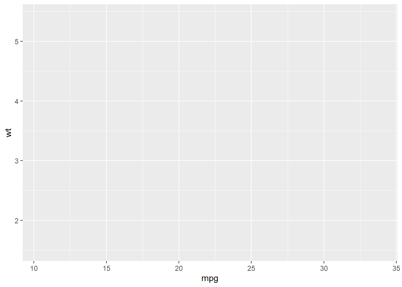
- Data Frame
head(mtcars)
##                    mpg cyl disp  hp drat    wt  qsec vs am gear carb
## Mazda RX4         21.0   6  160 110 3.90 2.620 16.46  0  1    4    4
## Mazda RX4 Wag     21.0   6  160 110 3.90 2.875 17.02  0  1    4    4
## Datsun 710        22.8   4  108  93 3.85 2.320 18.61  1  1    4    1
## Hornet 4 Drive    21.4   6  258 110 3.08 3.215 19.44  1  0    3    1
## Hornet Sportabout 18.7   8  360 175 3.15 3.440 17.02  0  0    3    2
## Valiant           18.1   6  225 105 2.76 3.460 20.22  1  0    3    1
- Plot foundation (
ggplot())- the data that will be included in the graph
- whenever we map variables into the plot, we use the
aes()function
library(ggplot2)
## Warning: package 'ggplot2' was built under R version 4.2.2
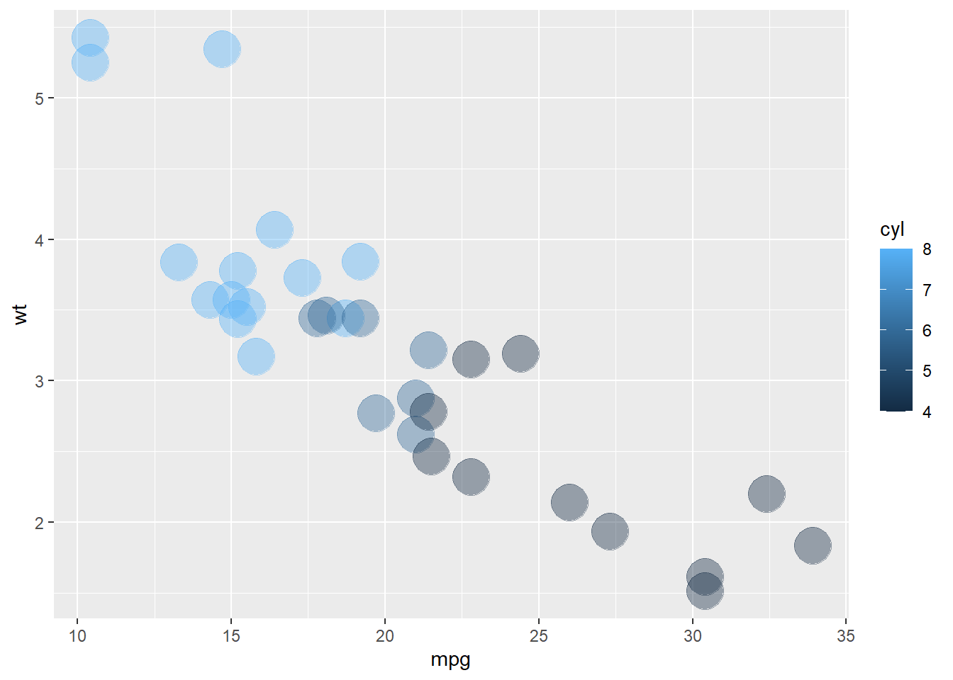
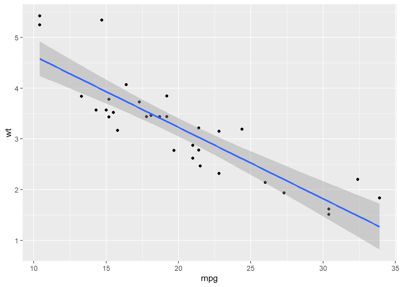
g = ggplot(data=mtcars, aes(mpg, wt)) # create the foundation of the graph
g
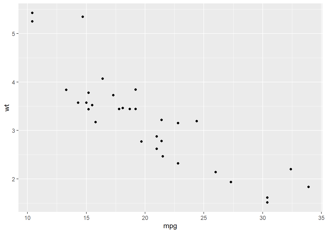
- Geometric layer (
geom)- adds shapes, lines, and points
- if no new variables are supplied, the geometric layer uses the base variables defined in the initial
ggplot()call - we combine the plot foundation with additional layers using
+
g + geom_point()
- Smoothing/trend layer (
smooth)
geom_smooth(
  mapping = NULL, data = NULL, ...,
  method = NULL, formula = NULL, se = TRUE, level = 0.95
)

mapping: Set of aesthetic mappings created by aes() or aes_(). If specified and inherit.aes = TRUE (the default), it is combined with the default mapping at the top level of the plot. You must supply mapping if there is no plot mapping.
data: The data to be displayed in this layer. If NULL, the default, the data is inherited from the plot data as specified in the call to ggplot().
method: Smoothing method (function) to use, accepts either NULL or a character vector, e.g. "lm", "glm", "gam", "loess" or a function (...).
formula: Formula to use in smoothing function, eg. y ~ x, y ~ poly(x, 2), y ~ log(x).
se: Display confidence interval around smooth? (TRUE by default, see level to control.)
level: Level of confidence interval to use (0.95 by default).
g + geom_point() + geom_smooth(method="lm") # OLS smoothing line
## `geom_smooth()` using formula = 'y ~ x'
- Conditional layers
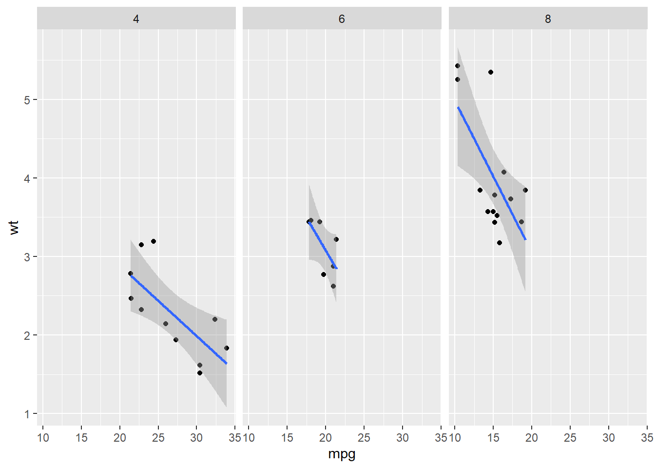
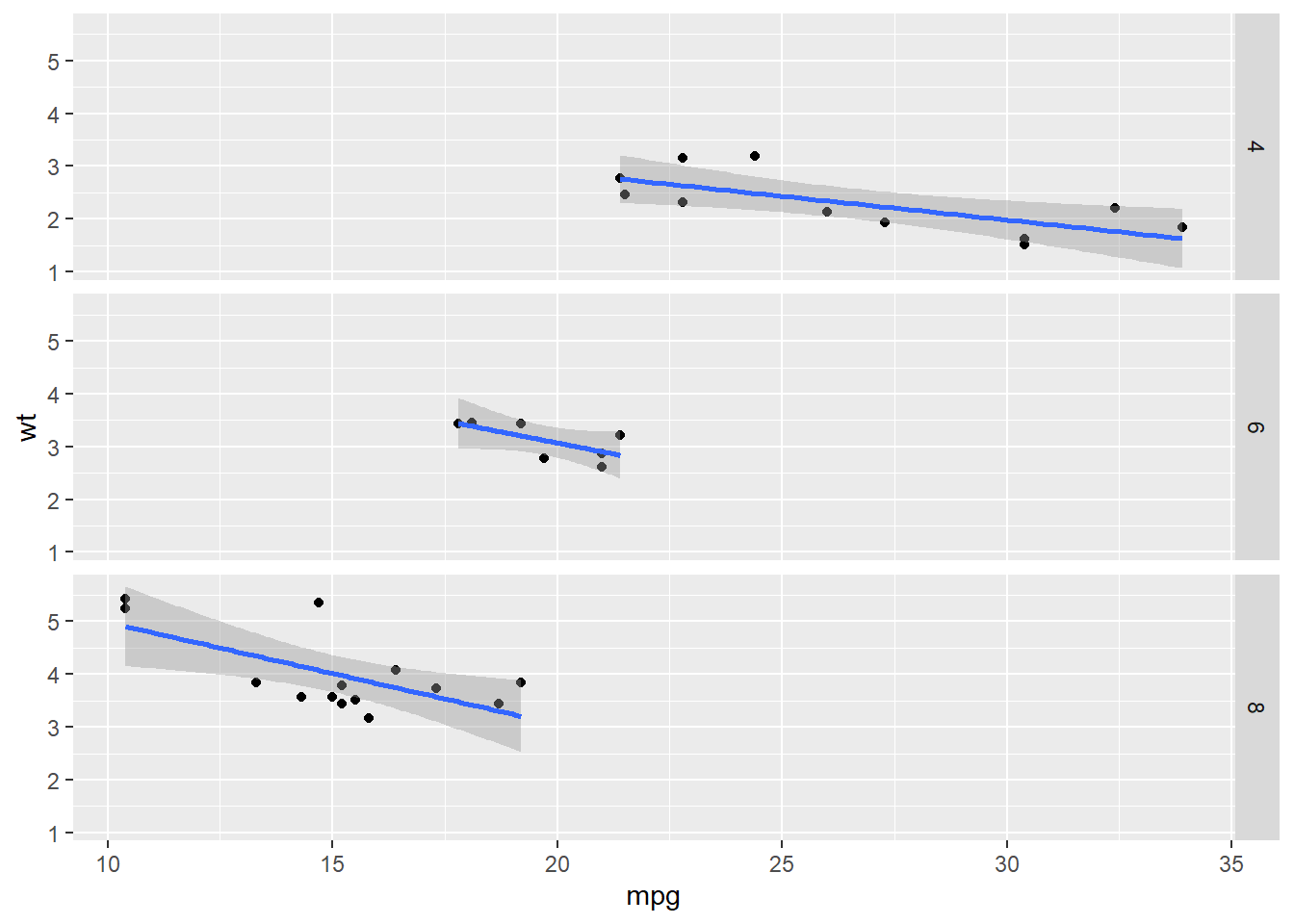
Facets (using
cyl)
g + geom_point() + geom_smooth(method="lm") + facet_grid(. ~ cyl) # group horizontally by number of cylinders
## `geom_smooth()` using formula = 'y ~ x'
g + geom_point() + geom_smooth(method="lm") + facet_grid(cyl ~ .) # group vertically by number of cylinders
## `geom_smooth()` using formula = 'y ~ x'
- Annotations
- Labels:
xlab(),ylab(),labs(),ggtitle() - Each geom has its own customization options, but use
theme()for global plot settings. Type?themeto see how many adjustments are available. - If you want predefined themes, two standard templates are
theme_gray()andtheme_bw()(black and white). Other themes are also available through theggthemespackage.
- Labels:
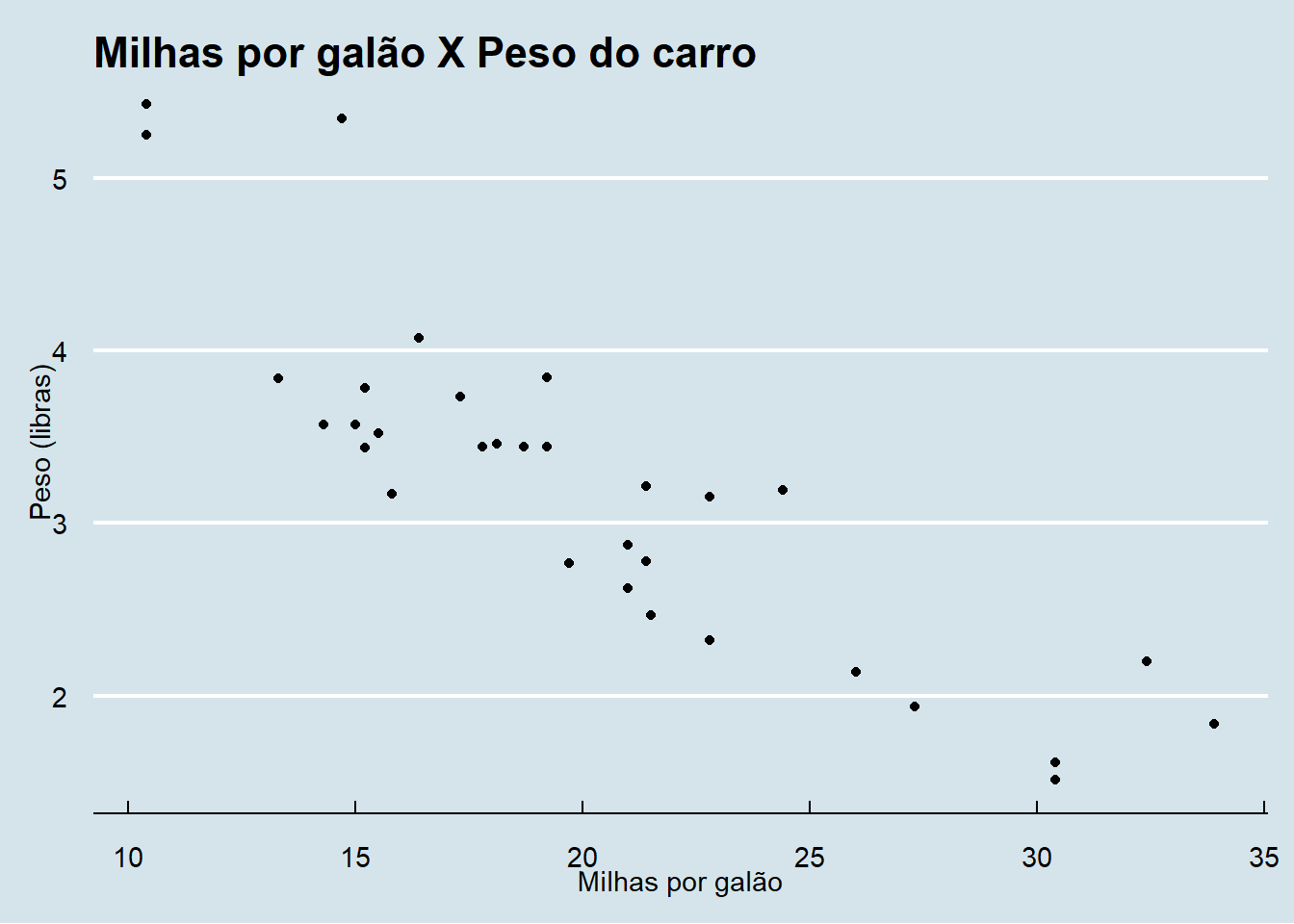
g + geom_point() + ggthemes::theme_economist() +
    ylab("Weight (pounds)") + xlab("Miles per gallon") +
    ggtitle("Miles per gallon vs. vehicle weight")
- Modifying aesthetics
- Within each geom, we can define color (
color), size (size), and transparency (alpha)
- Within each geom, we can define color (
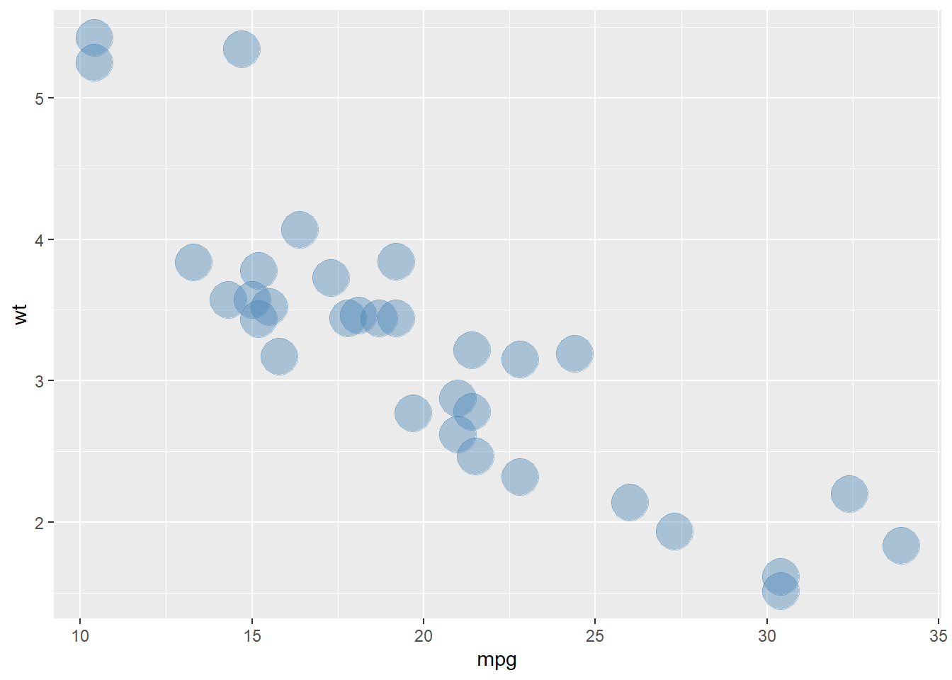
g + geom_point(color="steelblue", size=9, alpha=0.4)
g + geom_point(aes(color=cyl), size=9, alpha=0.4) # color by a variable - requires aes()